So here is how the last year looks on a graph in the context of everything since 1996:
The blue line is the sum of the other three. Medium term balance is liquid assets. We reduced these near the beginning of the year when we bought the house and the housing equity line takes off. Then mid-year I lowered the carrying value of our house in line with the local market. After buying the house, liquid assets have been pretty much flat as saving has been low and the financial markets performing weakly. The green line - retirement accounts - was also flat in this period. The net result is that we pretty much went sideways on the blue line too since early in the year.
This marks a clear break from the steep upward trajectory we've been on since late 2011. I got my current job in mid-2011 and then the financial markets performed quite well. At that point our spending wasn't that high yet.
This graph provides a slightly different view, breaking things down according to savings and profits. I don't break down housing equity into the two components as it's not worth it yet... You can see here that current savings (blue line) have been pretty anemic since buying the house, though retirement contributions continue on their merry way. Profits have been flat on both retirement and current accounts. In the long run we have done much better with retirement than with current accounts.
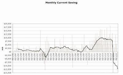
The next graph shows actual monthly non-retirement savings since 1996 and a 12 month moving average:
I have truncated the axis at -$15k but we dissaved $53k in January and $118k in February as we bought the house. As you can see, monthly savings peaked at an average of $10k per month in 2012-13. From March to December this year we only averaged $1,700 per month. I hope saving will be higher than that this year, but it's not going to return to its previous level. First, we are paying off our mortgage, which doesn't count as current saving and, second, Snork Maiden will be on maternity leave. She will get her regular salary till 8 weeks after the expected birth date. Later she will receive the minimum wage for 18 weeks and otherwise not receive anything. I think other baby expenses will be like a "rounding error" by comparison.
What about investment performance? This graph compares our "accumulation index" or "total return index" to the market indices since the depths of the financial crisis stock market crash in March 2009:
As you can see, our performance is very closely linked to the Australian stock market. For a few years we lagged behind the market, but more recently we have outperformed it and now have about the same gain as the ASX 200 since the GFC. In the meanwhile, international markets have performed more strongly, at least until the last few months.


2 comments:
Long time no see, sort of speaking. First of all congratulation on buying the new house.
It is very rewarding to see that your net worth surpassed 1,5 mln. With international markets - it is really depends. Last year S&P 500 return about 1%.
How do you do you comparison, technically, i.e. would you record a date when you invested in Australian market and do the same for S&P 500, for example?
Or is it more simplified, i.e. begging and end of the year?
The graph you see in this post is just a comparison of cumulative performance since February 2009. But I calculate our rate of return for each month every month and record the performance of the indices (including dividends) monthly. Then I can do any comparison I like at monthly level of granularity as I have a total return index of my own investment performance measured every month. So, I could check the performance over the last 10 years, or last 3 months, or in 2010 as a whole or whatever.
Post a Comment