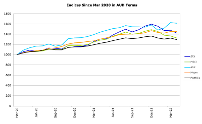
The graph tracks the performance of our portfolio (Moom, orange) since the March 2020 low versus various benchmarks. All of these are in Australian Dollar terms. So, for example, we multiply the S&P 500 index by the Australian Dollar - USD exchange rate and track that.
Our portfolio is now a little ahead of the S&P 500 and quite a bit ahead of the MSCI but has had a smoother ride than both. The ASX 200 is ahead of us, but has also been more volatile.The target portfolio (Portfolio, black) also has lower volatility but we have beaten it by fund selection and trading.
No guarantee that this performance continues, but our goal is to achieve market like returns with lower volatility. Also, it isn't as pretty in US Dollar terms. Our strategy is designed to give low volatility in Australian Dollar terms.

No comments:
Post a Comment